Redesign Project: Meetup app
Enhancing the Meetup app by improving navigation, refining the UI, and optimizing event discovery. This redesign focuses on usability, aesthetics, and engagement, ensuring a seamless experience for users to find and join events.
Role
UX/UI Designer
Duration
2 weeks
Team
4
Stage 1. Usability Audit
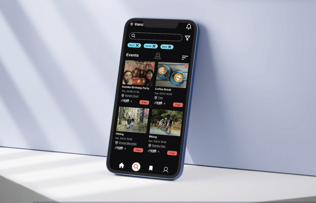
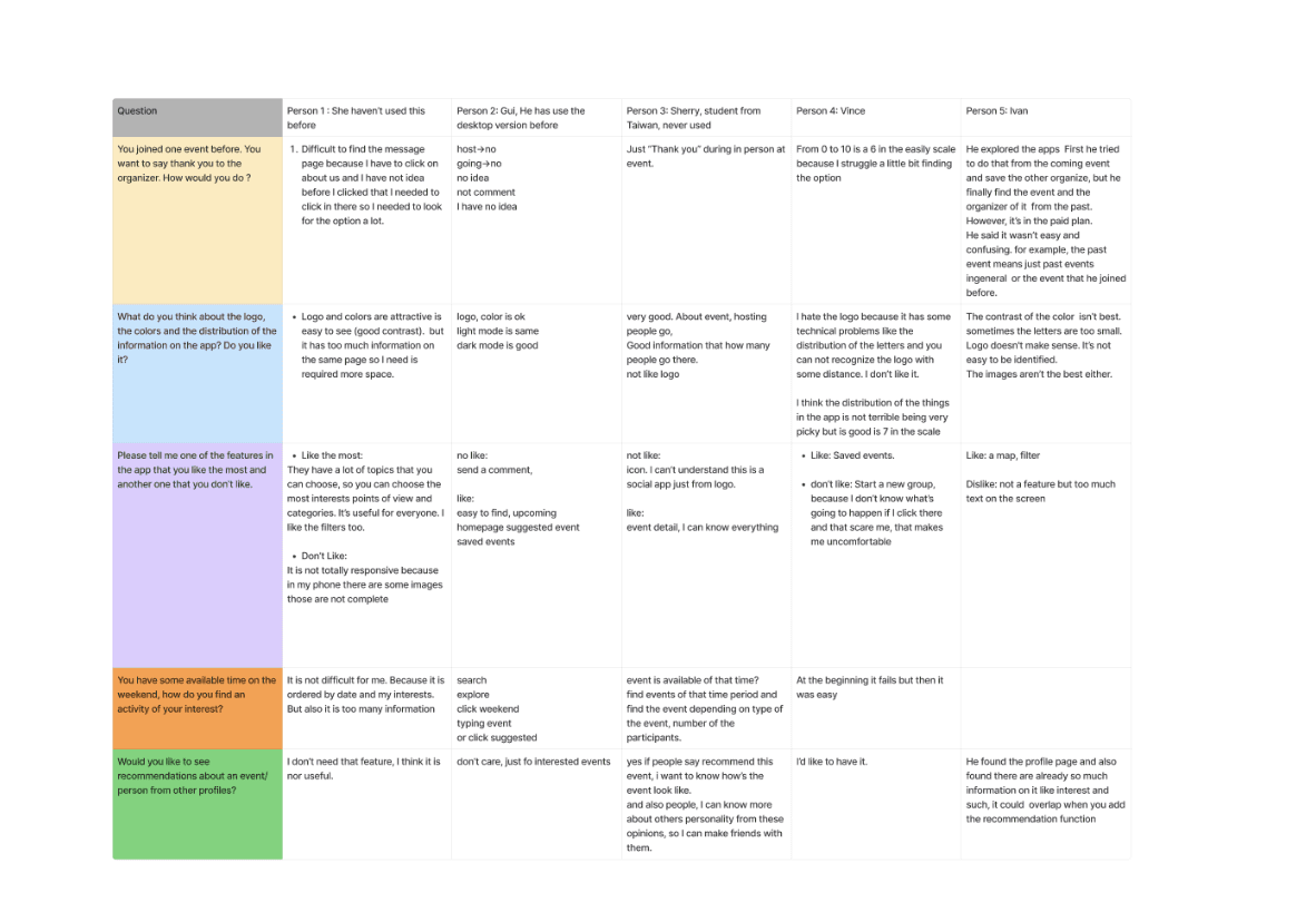
Initiated the project with a comprehensive usability audit of the existing app, employing usability testing and user interviews to identify friction points. This audit revealed significant areas for improvement, particularly in the app's navigation system, interface aesthetics, and overall interaction flow, ensuring a more seamless and visually appealing user experience.
Stage 2. Design Strategy
Decide the task handoff tool (Figma) and projected management tool (Trello).
Formulated a redesign strategy
Decide which pages should be redesigned: Home, Search, Event, Profile.
Assign each for the group members.
At each page, discuss which part should be modified or enhanced, that prioritizes a simplified user flow, enhanced interface visualization, and new search filters to simplify the search process.
Stage 3. Prototype Development
Inspiration:
Researched similar social apps to identify advantages and gather new ideas for improvement.
Wireframe:
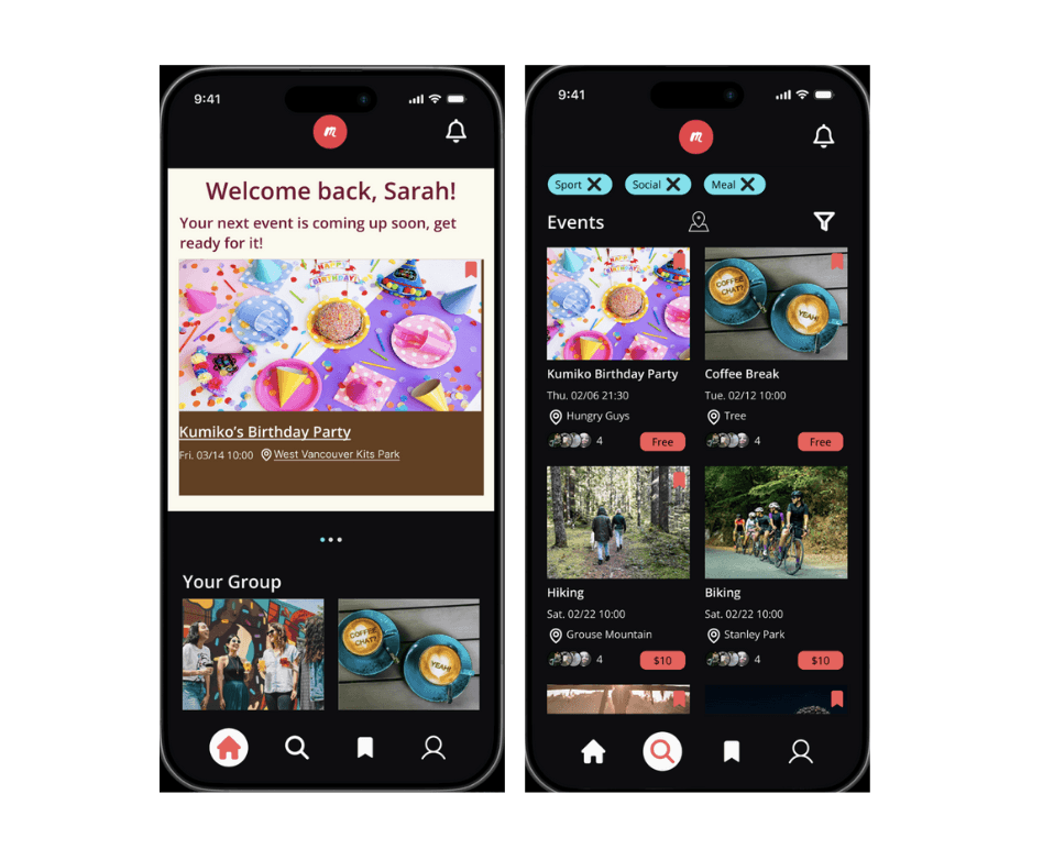
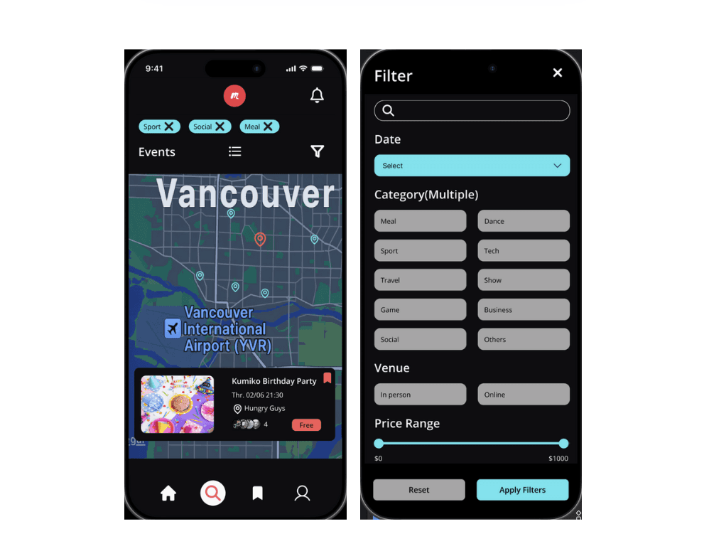
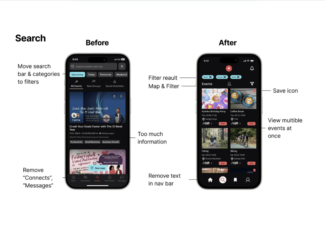
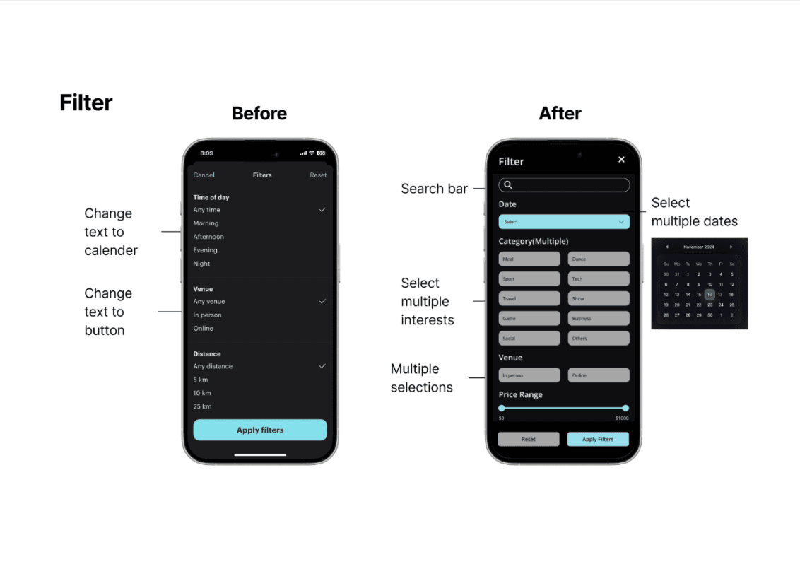
Redesigned the search page and user flows based on audit findings, focusing on reducing cognitive load and enhancing the overall user experience. Improved the filtering system by incorporating visual elements, offering multiple options, and making it more flexible for diverse user needs.
Stage 4. Mockup and Interaction
Design UI kit: Design UI kit: unify colors, align the head bar and navigation bar, and use components to make collaboration more streamlined.
Mockup:
Move the search field for all categories to the filter, change the event layout to two columns, allowing users to browse more quickly.
Users can select a date directly through the calendar.
The interest field allows users to select multiple categories and uses highlights and strong contrast to perceive interactions.
Stage 5. Refine and Presentation
Conducted iterative design reviews with the team to refine the prototypes.
Make sure interactive prototyping on each page are smooth.
Distribute slides to team members, covering tool selection, app and page redesign decisions, communication strategies, and result comparison with the previous version.
Reflections
The key takeaway from this project is the importance of team communication. We all need to follow the same design guidelines to ensure consistency. At times, we realized that certain elements, such as the head bar, font size, or font style, did not adhere to the guidelines. When this happened, we discussed and corrected them immediately.
After the redesign, the app became more visually appealing, simpler, and provided a better user flow. Although only four pages were implemented—rather than a complete version—it effectively demonstrated that users could find events more efficiently. In the future, additional pages can be added to enhance functionality.